The Age of Blossoms
- CNC | Featured | Other Crafts
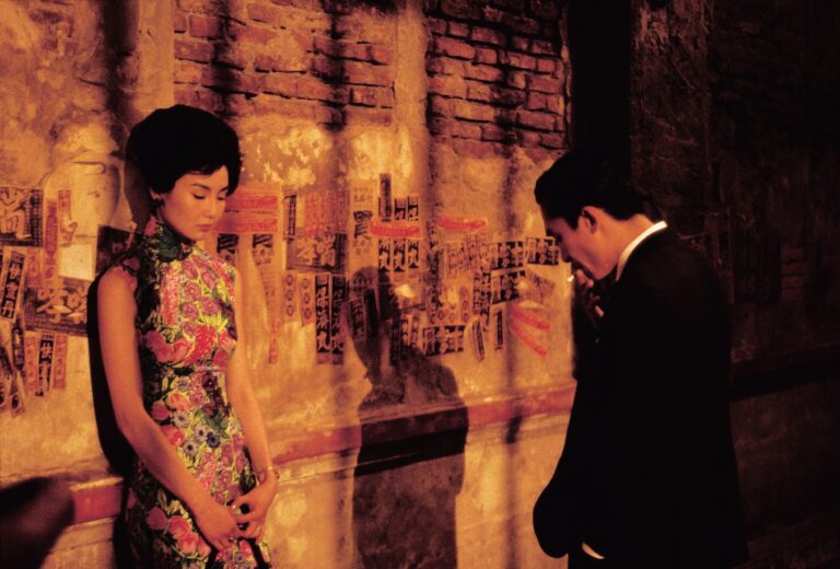
It is a restless moment. She has kept her head lowered… to give him a chance to come closer. But he could not, for lack of courage. She turns and walks away.
Project Timespan
December 3rd – 4th, 2020
Inspiration
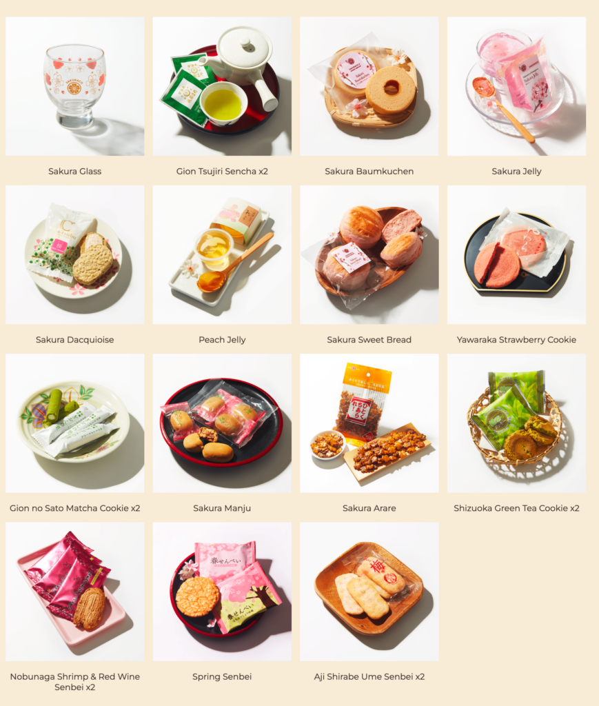
This past weekend, I took part with a few friends in a subscription-box tasting event, an activity with which I had no experience previously. The subscription box was from Sakuraco, a company that delivers authentic Japanese snacks every month, and the theme of March was Sakura Afternoon Tea. Of the contents within, I most enjoyed the Spring Senbei and the Yawaraka Strawberry Cookie.
In Japan, March marks the start of the cherry blossom (sakura) season, and with the early Spring comes the time of rebirth and growth. While munching on sakura leaves suspending in jelly, I was reminded of In the Mood for Love, a film portraying a man and a woman in 1960s Hong Kong as they slowly come to terms with the infidelity of their respective spouses.
A Hong Kong / French production, the film has entirely Cantonese spoken dialogue, and the original title of the film is 花樣年華, translated as “The Age of Blossoms” or “The Flowery Years,” a Chinese idiom for fleeting moments of love and beauty.
There are a select few films in which each still frame can be taken in isolation and be appreciated as art, and I would say that In the Mood for Love is one such masterpiece.
I now realize that I am reflecting not on the inspiration of the project, per se, but rather the inspiration for finally writing up a post on the project – if that makes sense...
Alright, the creation of this project arose from a Secret Santa event. For such occasions, I prefer to make a handmade gift customized to the giftee. In this case, I knew that my target individual is a big film aficionado and adores this movie, so my mind immediately jumped to finding posters and artwork of the film.
Project Design
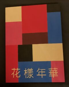
There were two aspects of the build that I wanted to incorporate into the design. One, it had to include the original film title written in Chinese. Two, I wanted to have the iconic flowery qipao worn by Maggie Cheung’s character to highlight a theme of the movie.
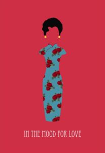
With these two requirements in mind, I searched online for designs. There were several editions of the original poster featuring Maggie Cheung and Tony Leung, but I opted for something more minimalistic. I came across a design that I really admired:
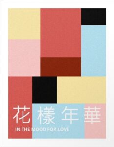
While this design was fitting, I did not particularly want to have a solid red background. I looked further for a geometric pattern and found a beautiful design from Society6.
I took elements from both designs – the hair and dress from the first poster and the background and Chinese title from the second. The background colors were too muted for my taste, so I opted for something brighter in the final version.
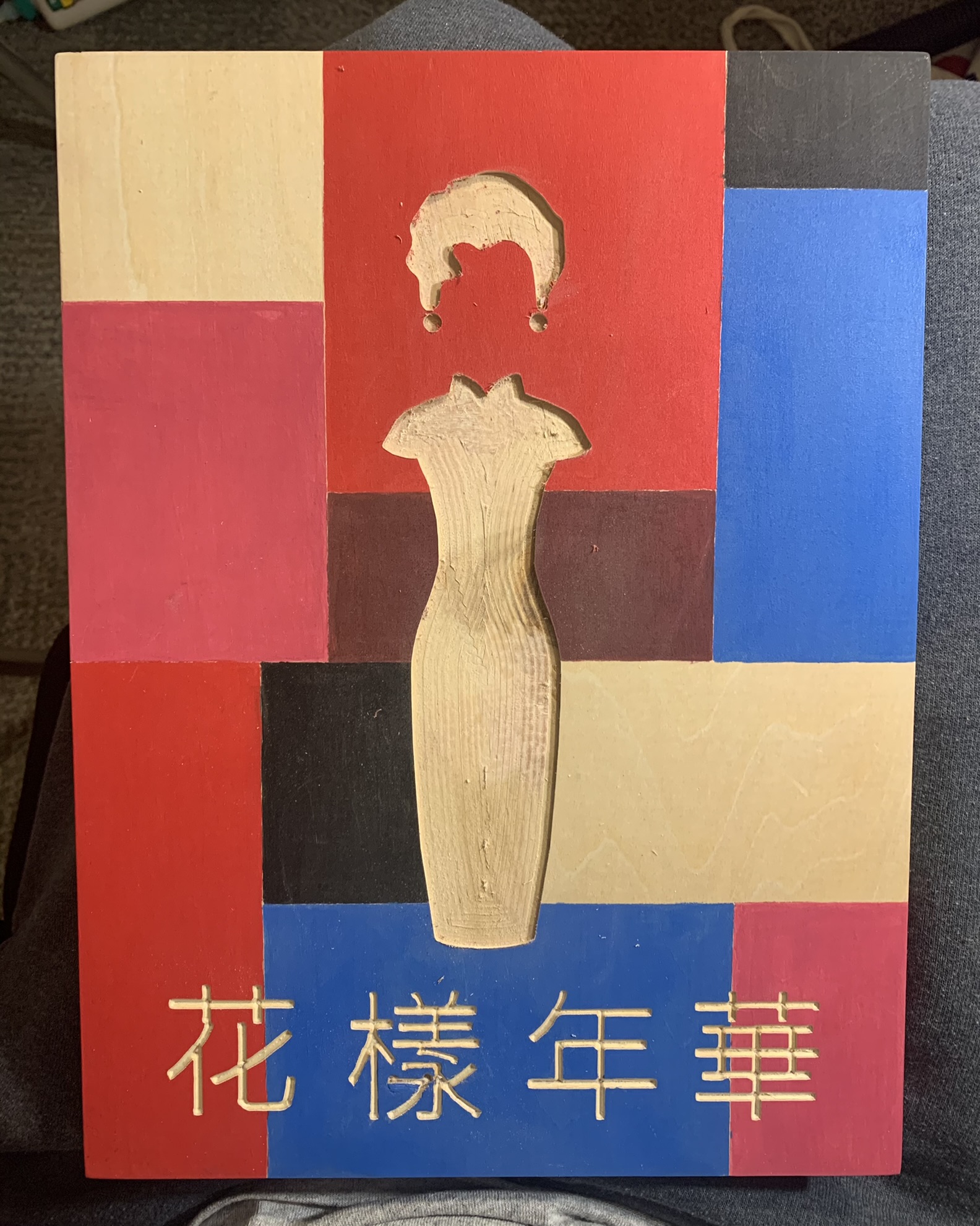
I converted the figure of the first design and the title text of the second design into .SVG format for modelling work in Fusion360. I wanted the figure to be sit proud of the background shapes, though not protruding too far, so I added an silhouette recess into the surface. I had 1/4″ hard maple on hand that I would later use as the stock for the figure, though any wood species was adequate given that these pieces would later be painted over.
For the qipao, I wanted to draw the observer’s eyes to the roses, so I opted to add in inlay with 1/8″ bubinga wood rather than painting them in. The 1/8″ recessed areas for the roses can be seen clearly in the third image.


Project Materials
Blick Studio Wood Panel – 9″ x 12″ x 1.5″
Assorted acrylic paints
Ruler
Utility knife
Bubinga (inlay), 1/8″ thickness
Maple, 1/4″ thickness
CNC Router
A CNC router is not necessary for this project, but it makes the task of carving/cutting out the figurine, inlay work, and movie title text much easier.
Project Construction
I began first with the painting of the frame. I prepped the frame by scoring the lines of the color boundaries with the aid of a utility knife and a ruler. As I wrote earlier, I thought the colors of the second design were more muted than to my liking, so I went with bright primary colors à la Mondrian. However, I did keep in the natural basswood color rather than paint in yellow.
I began first with the painting of the frame. I prepped the frame by scoring the lines of the color boundaries with the aid of a utility knife and a ruler. As I referenced earlier, I thought the colors of the second design were more muted than to my liking, so I chose bright primary colors à la Mondrian. However, I kept the natural basswood color rather than paint in yellow, if only to preserve a section of the wood grain.


CNC work comprised the next part of the project. I used an engraving bit for the title text, but an accident occurred when the bit strayed from the toolpath. I was able to stop the run in time to prevent a catastrophe, and I patched the mistake with some scrap wood and glue before painting over the area. After the paint dried, I ran the engraving operation again, and this time it went smoothly! I was beginning to make mistakes; it was getting late, around nine in the evening, and I had an examination the next day at eight, so I called it a night. You can make out the mishap in the lower right of the second character, though I would argue that I did a good job in hiding the accident.
As an aside, at times I find myself extra-creative on the eve of a semi-important test. For example, the afternoon and evening before my medicine shelf examination, I spent several hours completing the final rows of the Philadelphia mosaic.
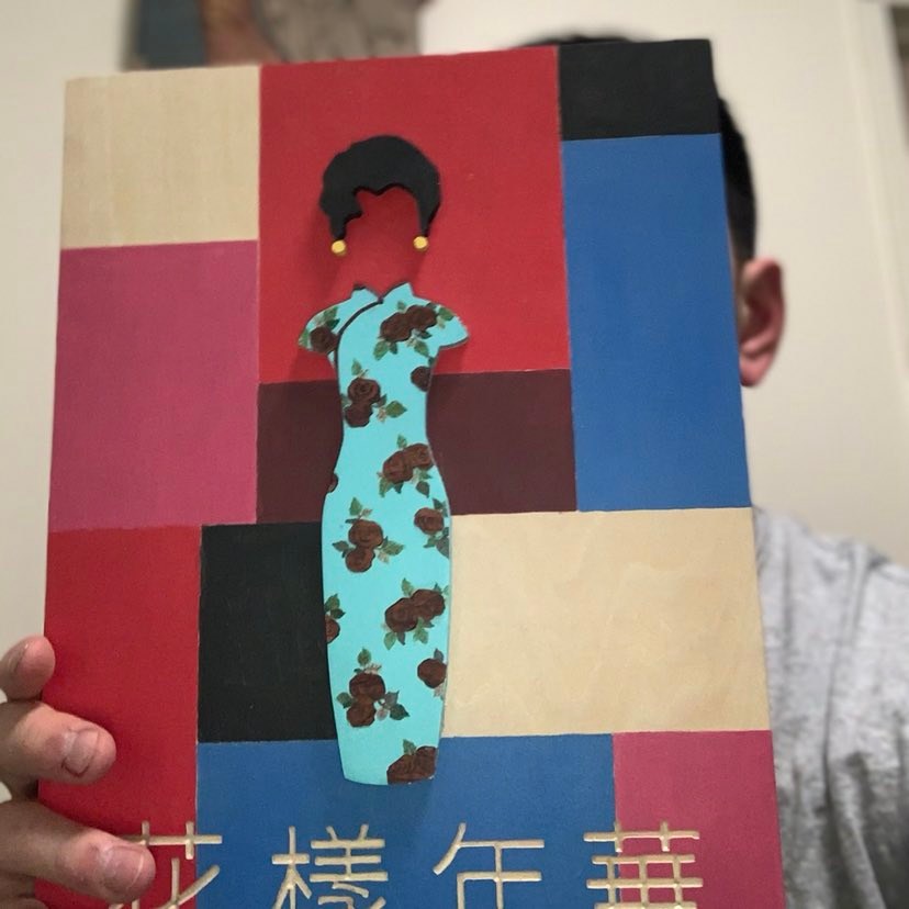
The following morning, after the completion of my pediatric shelf examination (which was actually not straightforward…), I went immediately to work on the project. I used the CNC machine to cut out the hair, earrings, and the qipao and its indentations for the inlaid roses. I then painted the dress and leaves.


As for the inlaid roses, it was tricky business cutting out the 1/8″ inch bubinga roses given the small, thin pieces that resulted. I also resorted to using thin lines of black paint to bring out the contours of the bubinga roses. I wanted the roses to stand out, so I finished them with a few coats of glossy tung oil before gluing them into the recesses. I realize that tung oil finish generally takes days to cure, but a bit of buffing off the excess oil was sufficient given the size of the pieces.
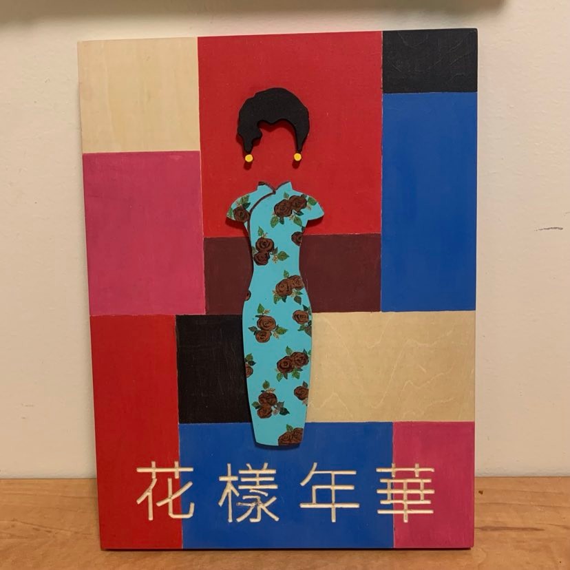
With the figure painted, the remaining step was to use the CNC router to mill out a recess for the figure silhouette and glue everything together. An added bonus with the recessed silhouette is that it makes for a very stable connection after glue-up.
I had some trepidation given that the project was so close to completion, but everything went well in the end. It was about 11:30 at night when I finished the project – what a productive two days!

Lessons Learned & Improvements
After completing the project, the wood panel looked so neat that I was loath to part with it!
I’ll divide up this Lessons and Improvements section into two lists: five features that turned out amazing and five considerations if I were to revisit this project.
Five features that went right:
1. Colors: I stick with my gut that the bolder background colors complement the foreground well.
2. Lines: Not perfectly straight, but nearly so! As good as I can do without tape (which in hindsight was also an option).
3. Depth: Having the figure proud of the background makes for a more intriguing composition.
4. Painting: The leaves and roses pop out nicely even from the beautiful turquoise blue of the dress. The glossy finish over the bubinga roses also catches the light when viewed from different angles.
5. Frame: Both the 1.5″ depth and the 4:3 ratio of the frame face lend to a nice layout ratio. The background color extends to the sides of the frame as well – no cutting corners here!
Five considerations for the future:
1. Epoxy text inlay: This would require beginning with the text engraving, then fill with epoxy and sand smooth. Afterwards, I could proceed with painting of the geometric background rectangles.
2. Sculpted roses: Instead of bubinga inlay, an alternative would be sculpture of the roses/leaves with modelling clay (though this would be not be as accurate to the movie).
3. Intarsia figure: Ebony for the hair, yellowheart for the earrings, and a different qipao whose colors can be reproduced faithfully in wood!
4. Multiple design qipao: Joined together on slanting parallel angles (i.e. a different design in the top quarter, second quarter, third quarter, and bottom quarter of the dress) to showcase the multiple qipao worn throughout the film.
5. Flowery background: In lieu of the geometric design, the background would incorporate elements from other qipao designs.
Reflection
For fun, I went to great lengths to pass off the gift as something I ordered online, as I created a fake packaging label and wrapping as if the gift came from Etsy or some other online retailer! I don’t think I fooled him entirely, but it was a close thing for a minute or two during unwrapping. As I had anticipated, my Secret Santa giftee highly appreciated the work and had even been looking for artwork from In the Mood for Love as apartment decoration. What glorious serendipity!
Though it was but a two-day affair from beginning to end, I put in the time to create something worthwhile and beautiful. Based on the time stamps of the photos taken, I spent approximately five hours on December 3rd and six hours on December 4th to finish it off! Not to mention, in between the crafting I took a nearly three-hour long pediatric shelf examination the morning of Friday of December 4th. Thank goodness for pass-fail NBME exams!